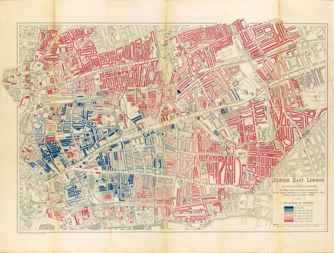
A map may seem harmless – even helpful. It shows you where you are and how the world connects. But what if a map wasn’t just about geography? What if it was designed to shape opinion – to turn an entire people into a perceived threat? That’s the warning behind a powerful new study by Israeli historian Dr. Zef Segal. His research reveals how maps – once thought of as neutral tools – were systematically used to promote antisemitic propaganda across Europe. They weren’t for orientation. They were instruments of incitement.
When Maps Served Hate
In the late 19th and early 20th centuries, as Jewish communities migrated within and beyond Europe, newspapers, academic institutions, and governments published maps to “track” Jewish movement. But the intent behind these graphics was far from neutral.
In Nazi Germany, maps portrayed Jewish migration as an infection – arrows spreading across borders, “foreign” clusters marked in alarming colors.
In Britain, similar visuals warned of so-called “Jewish influence” in finance, politics, and society.
Even in academic settings, Jews were reduced to visual statistics – dots on a map, stripped of humanity and used to justify discrimination, fear, and exclusion.
Dr. Segal’s research shows that these maps didn’t merely echo antisemitic worldviews – they shaped them. Cartographers made deliberate choices about what to include, emphasize, or erase. The result was a kind of scientific-looking racism: clean, calculated, and deeply influential.
What the Research Reveals
After analyzing hundreds of historical documents and maps, Dr. Segal found:
A direct link between antisemitic ideology and cartographic design – where Jews were made hypervisible and framed as a threat
No academic neutrality – many maps were sponsored or distributed by political bodies intent on spreading antisemitic fear
Strategic distortion – complex migration stories were flattened into one-sided graphics portraying Jews as invasive, foreign, and numerous
These weren’t mistakes. They were purposeful. And they worked.
What Does This Look Like Today?
In 2025, we don’t need maps to manipulate public perception. Today’s tools are faster, more accessible, and harder to track.
A Wikipedia page omitting Jewish history or downplaying antisemitic attacks
A TikTok video using emotional edits to distort the Israeli-Palestinian conflict
A viral infographic or meme “proving” Jewish control over global power centers
Like the antisemitic maps of the past, these are presented as objective facts – but they’re built to mislead. They erase nuance, exploit visuals, and exploit trust in data.
What This Means for Us
Dr. Segal’s work is a powerful reminder that today’s antisemitism isn’t new – it’s just packaged differently. Objective facts are still manipulated. Visuals still mislead. And when left unchecked, even the most ordinary-looking image can normalize hate.
We track these manipulations every day. We’ve seen how quickly an infographic becomes a weapon. How fast a manipulated map can reinforce conspiracy. And how many people don’t think to question what they’re shown.
Our task is not easy. Along with advocating for changes in monitoring and ensuring data verification, we emphasize education. Critical thinking. Familiarizing yourself with the past.
So we’ll ask you this: Next time you see a “factual” image about Jews, Zionism, or Israel – who made it? What did they choose to leave out? And why?
Understanding the past is the first step to recognizing how antisemitism evolves.
At FOA, we offer workshops, talks, and training programs that help students, educators, and community leaders identify modern-day antisemitic content—especially when it hides behind maps, memes, or misinformation.
🧭 Join our educational programs and become part of the effort to expose online hate and misinformation.

